How to create timeless low contrast photos
If you’re a fan of photography – especially ‘people’ photography – you’ll probably have noticed a growing trend for professionals to process their images with a washed out, low contrast look. Popular with portrait and wedding photographers, this style can turn an ordinary set of images into one that oozes class and a dream-like quality you might struggle to obtain any other way. This week we’ll show you how to achieve it – it’s easier than you might think!
Choose your image wisely
It’s quite hard to decide what kind of image works for this style and what doesn’t – to an extent, you just have to suck it and see. Certain images always work, though: relaxed poses in natural surroundings, beautifully lit window portraits, or kids playing in the evening sunshine, for example. Part of the fun of trying a new processing style is experimenting, so drag some pictures out of your back catalogue and get stuck in.
Colour or black and white?
This style works equally well in both, thankfully. The same rules apply to low contrast images as those processed in any other style: if the shot has good tonal range it will probably work well in black and white, whereas if it’s very busy with poor subject to background separation, it’s best to leave it in colour. The process We’re going to do this in Lightroom for this example, but it’s relatively easy in Photoshop or any other editing suite. Don’t worry, it really is very simple!
1. Open your chosen image up in the ‘Develop’ module in Lightroom.
2. Go through your standard basic editing process, like enabling profile corrections and adjusting white balance.
3. Open the ‘Tone Curve’ tool and select ‘Custom’ in the ‘Point Curve’ box.
4. You should now see a straight line from the bottom left to top right of the tone curve box. Click and hold on the bottom circle of the line and drag it upwards.
5. You will see that the contrast in the image is lowering as the black point is moved nearer to the white point.
6. Experiment with doing the opposite with the top right point of the tone curve to lower the white point.
As you can see, this has very quickly altered the feel and look of your image. If you wish to increase the vintage feel you can experiment with lowering the colour saturation and vibrancy. We like to drop the saturation and increase the vibrancy a little, but it’s really up to you.
As with all processing techniques, we do caution against going too far – a little goes a long way so don’t be tempted to move the black and white point too far or you’ll lose too much tonal range.
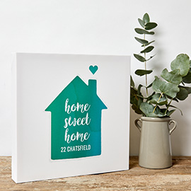
We hope that this tutorial has given you a new tool to add to your processing toolbox, and helps you create some beautiful, timeless images of your loved ones. These low contrast photos look fantastic printed to canvas, so why not choose some of your favourites and send them over to us!